Ah, college football.
Who doesn’t love watching unpaid students risk their physical and mental health with hundreds of thousands of people cheering them on in the name of school pride?
(Apparently, the United States Supreme Court.)
But we don’t talk about that much in these parts. Over here, we talk jersey designs.
And with about two months before the scheduled start of the NCAA college football season, what better way to prepare than to rank the top 12 uniforms in the sport?
Just to clarify before I begin, I will be providing you (the reader) with my rankings of FBS team (Division I) college football uniforms from the United States. These are not rankings of team uniform sets. I am featuring, discussing, and ranking individual uniform combinations.
For example, if I were to talk about Clemson (which I won’t be), I would be choosing ONE of their uniform combinations, such as orange helmet – white jersey – orange pants, and none of their other uniform combinations would be part of the selection.
Now, what makes a good American football uniform?
Effective and pleasing team colors. Great balance of colors. A number font that’s either a classic traditional block, or a variant that mixes just enough personality into maximum legibility. A consistent striping pattern throughout the uniform. Unique helmet design. A combination of history and objective appeal. The question I asked was: what teams not only have an identifiable and iconic look, but also one that’s extremely visually and aesthetically appealing?
One thing I discovered during my research is the disappointing lack of consistency in team sock colors. Some schools do it really well, with the whole team wearing socks that best fit the uniform. Other schools have every player wearing the same color socks, but in just white or black, which rarely improves the uniform at all. And yet other schools seem to just let their players wear whatever color socks they feel like, resulting a mix of white, black, and team color shins and ankles sprinkled across the field.
Keep in mind, there’s no such thing as a perfect football uniform. Especially in the world of college, where constantly changing manufacturers, along with the sheer number of schools, make it difficult for some teams to get their look right, and for others to truly distinguish themselves from the rest of the pack.
My process for determining this list was first to brainstorm and come up with a list of schools I knew could be in the running. Next, I scoured over both still images and game highlight videos, finding which teams truly had the best gridiron apparel. It was crucial to me that the uniforms I picked not only looked good in photo shoots, but in in-game action as well. There were some uniforms I had on the list whose rankings fell once I saw they didn’t function as well on the field as they did off it. There were others that snuck their way up, if not onto the list, for similar reasons.
Form follows function.
But in the end, I came up with 12 winners and 6 honorable mentions.
These may be controversial.
Buckle up.
Honorable Mentions

As you can tell by my six honorable mentions just outside my 12 picks, my standards are high, I don’t mess around, and you’re in for some surprises here.
Alabama
Crimson Helmet – Crimson Jersey – White Pants
That’s right. Not used to seeing Bama outside the Top 12, are ya? They were the closest to making the cut out of all my honorable mentions.
There are a ridiculous number of college football teams with a shade of red and white as their team colors. Bama. Nebraska. Oklahoma. Indiana. Louisiana. Wisconsin. Even Arkansas & Houston could fit in that category.
While Nebraska’s a close second for red-and-white schools, Bama takes the cake in that category. The helmet numbers are phenomenal, and its that detail, combined with the fact that they’ve taken one of the most simplistic looks possible and turned it into something immediately recognizable is why their crimson jersey – white pants combo was so close to making the Top 12.
Auburn
White Helmet – Navy Jersey – White Pants
Their rivals are right behind them. There’s nothing like having a solid white block number on a dark jersey, with a white helmet and white pants around it. You almost can’t go wrong with that. This uniform is almost perfect, design-wise… the only thing that kills it is the fact that the striping on the pants is nowhere close to what’s on the helmet and jersey. Orange is a great accent color with navy, but the navy, white, and orange all together falls just short. If the Tigers went and fixed those pants stripes… I think they’d be in the Top 12 for sure.
Iowa
Black Helmet – Black Jersey – Gold Pants
Iowa look like the Pittsburgh Steelers but with a slightly better number font. The fact that the font is so close to a standard block but is a little funkier and a little wider definitely throws me off, but it’s a great uniform nonetheless. Hard to go wrong with their home combo.
Tennessee
White Helmet – Orange Jersey – White Pants
Now, I am not a fan of orange as a primary team color. But Tennessee pulls it off so well. They own that shade, and the white helmet with a white facemask just completes an absolutely classic look. It’s great, but not spectacular. There’s only one other team that pulls off orange better than them, and I’ll be talking about them later.
Oregon State
Black Helmet – Wood Jersey – Wood Pants
I absolutely had to give this uniform some love. This is the only uniform on this list where the jersey and the pants are the same color, because monochromatic looks usually end up too lacking in one color or too saturated in another. I love this uniform. The off-white “wood” colored set just works so well with the black and the orange accent on it. Shoulder stripes match the pants stripes, black socks to match the black helmet, and an excellent number font on top of it all. An underrated 2019 rebrand for the Beavers, for sure. Still not sure about the “Beavs” across the front, though. Do people actually say the word “Beavs”? Try it. Try saying “Beavs” out loud. Sounds weird, doesn’t it? “Oh yeah, I’m a Beavs fan.” Really? Are you really?
Washington
Gold Helmet – Purple Jersey – Gold Pants
This might be more of a testament to the color scheme than anything else, but gold helmet, gold pants, with a purple jersey? It’s gonna be good. Those colors are just too good. Props to Washington for not screwing it up. It’s not a “greatest in college football” quality uniform, but it’s a gosh darn excellent looking one on the field for the Huskies.
Alright, let’s get to the countdown.
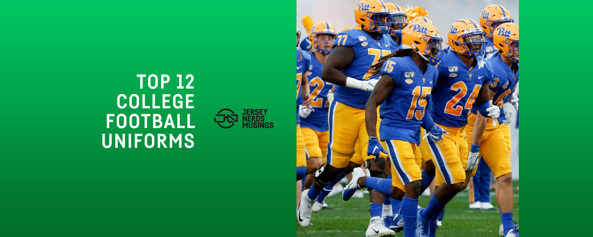
No. 12 – University of Pittsburgh

University Gold Helmet – Game Royal Jersey – University Gold Pants
The Pitt Panthers’ previous look of navy and gold wasn’t terrible, but it was particularly lackluster. The team’s decision to switch to their throwback colors full-time was the best one the could have made.
The script “Pitt” across the helmets is iconic. The uniform doesn’t try to do too much, but does just enough to let the colors and design elements speak for themselves.
The block font has some strange quirkiness in it but it also remains legible and well-constructed, which is a balance you always look for in a football jersey. Pants and helmet stripes have the same general idea, which is a plus, and overall, this is how a football uniform should look.
It’s great.
But we’ve got plenty more to go.
No. 11 – Florida State University

Gold Helmet – Garnet Jersey – Gold Pants
Garnet and gold.
First off, shoutout to Boston College for finally getting their own uniforms right after falling short of their potential for quite a few years now.
Both schools have a great color combination, and their uniforms have often been ridiculed for being too similar to each other. But there’re a couple things for me that elevate Florida State into my Top 12.
I’m a sucker for helmet designs that go beyond just slapping a team logo on the side. They’re not the first football team to have a spear on their heads, but only theirs has both endured and reached such high levels of praise and notoriety.
The pattern on the sleeves as well… my gosh, it’s incredible. While not anything historic in FSU’s football program history, that embroidery style look has become iconic and synonymous with the tea.
I’m sure glad that the pattern is allowed to shine on the sleeve, and having nothing on the pants allows that to work for sure.
Plus, that thick angular number font is great. It’s like what the Tennessee Titans were supposed to have as jersey numbers.
FSU switched back to white numbers last season (having had gold ones for the last eight or so years) and while it definitely makes the jersey a little more boring, when looking holistically? It made a good uniform even better.
No. 10 – University of Southern California

Cardinal Helmet – Cardinal Jersey – Gold Pants
USC owns this color combo like no one else. And they don’t need flashiness to do it.
What the uniform has in lack of striping consistency it makes up for in timelessness. No names on the backs of jerseys, only two colors across both the pants and jerseys… nothing fancy required.
The icing on the cake? Honestly, it’s the classic grey facemask on the iconic cardinal red helmet, the Trojan logo on the side just as it should be.
The road uniform is absolutely awful compared to the home, as you get a white and red jersey with gold pants, throwing the color balance way out of whack. The cardinal and gold color scheme, combined with simple design elements, does the trick for SC.
No. 9 – Pennsylvania State University

White Helmet – Navy Jersey – White Pants
I’m still not sure what a Nittany Lion is.
But this uniform baffles me just as much.
Navy and white is one of the most boring color palette’s any team could ever be stuck with.
So why the heck does this uniform feel so right?
When things are simplistic, every detail has to be right. And with Penn State, every detail is. A white helmet is a single navy stripe down the middle? Plain navy jerseys with only white block numbers on them? No names on the backs of the jerseys? Plain white pants, too? This uniform is as basic and simple as it gets.
And yet, there’s nothing about it that feels lazy, cheap, or underdone. Everything feels balanced and in its place… the white shines bright, the navy its dutiful counterpart.
If you tell me they don’t look good… I’m sorry. You’re lion.
No. 8 – University of Michigan

Navy and Maize Winged Helmet – Navy Jersey – Maize Pants
Good job, Michigan.
You’re this high on the list because you’ve got one of the most unique, recognizable, and iconic helmets in all of sports.
All you had to do was not screw up the rest of the uniform.
And you didn’t. Everything else is so simple, the uniform just lets the winged helmet do most of the talking.
And talk, it does.
Without the helmet, this is just a Penn State uniform with a better color scheme. That, combined with the helmet design, put it one spot up on the list.
But this uniform would kinda suck without those yellow pants.
No. 7 – University of Notre Dame

Metallic Gold Helmet – White Jersey – Gold Pants
It’s one thing to have an iconic football helmet design.
It’s another to make the most recognizable helmet in college football be one color and have absolutely no design elements on it.
I originally had Notre Dame’s classic navy on gold combo at this spot… but the more I watched highlights and game film of it in action, the more I realized something.
That uniform looks really, really good.
In pictures.
On the field, at least in recent years, it’s a different story. With a dark navy jersey that’s rather plain, your eyes are most drawn to the brightest, more colorful things on the players: the helmet, the pants, the numbers.
The metallic gold helmet is excellent… but it’s a hard thing to find pants that perfectly match it. This is the issue that Notre Dame has. Compared to the helmet and with navy next to it, it becomes apparent that their pants, at least in most lighting environments, are a little too dark, a little too saturated, a little too green even.
It’s this annoying little inconsistency that puts their white uniform above the navy one for me. The white jersey in-between the helmet and pants makes the golden discrepancy a lot less apparent, and helps to elevate the uniform to what it should be.
Plus, white numbers with a gold outline on a navy jersey will NEVER look better than navy numbers with a gold outline on a white jersey. That’s my opinion an objective fact.
This is a curiously simple uniform. I mean, the most complex thing on it is the ND logo on the sleeve.
The current Under Armour block numbers aren’t perfect in construction or in size, but everything else absolutely is. Especially that helmet.
Shine on, you crazy Irish.
No. 6 – The Ohio State University

Silver Helmet – White Jersey – Silver Pants
One of THE most classic brands in college sports.
I went with the white jersey over the red because I LOVE how that red number stands out and becomes the main element of the uniform. A big red number, complemented by the red in the striping on the helmet, sleeves, and pants. Gosh, those stripes are so good. And so consistent!! (Which should be easy to do, but it’s harder than you think in college football.)
A traditional block font on the jerseys keeps it grounded, and those buckeyes on the helmet elevates it to new heights.
No. 5 – Kansas State University

Silver Helmet – Purple Jersey – Silver Pants
You heard me right! K-State in the Top 5!
Sorry Paul Lukas, I’m a sucker for purple sometimes. But ignoring that fact, this is an EXCELLENT football uniform.
Yes, KSU looks a lot like the NFL’s Dallas Cowboys. It’s not a direct rip-off like Iowa does (with permission, I know), but it’s absolutely an improvement.
Football uniforms where the helmet and the pants are a perfect match are usually the best ones. This is absolutely the case here. Same color and same striping on both of them. A color like silver is the absolutely best complement to a purple jersey too, balancing out the uniform in a way that only silver can.
The only thing that bugs me is how the helmet stripe decal is a slightly darker purple than the rest of the uniform, but maybe that’s some historically accurate thing or something.
The purple home uniform is heads and tails above the away uniform, because while I love the consistency of the set, the purple definitely doesn’t stand out as much when it’s reduced to the jersey number and the rest of the uniform is mostly silver and white (in contrast to Ohio State, whose red works much better in that situation).
Either way, don’t you ever tell me purple doesn’t belong on the gridiron.
Kansas State proved you wrong.
No. 4 – University of Texas at Austin

White Helmet – Burnt Orange Jersey – White Pants
Burnt. Freaking. Orange.
Who would’ve know that color could look so darn good on a football field?
Or that that color could perfectly embody and represent a school, a lifestyle, a culture?
The “TEXAS” wordmark is in a perfect slab serif font, though it does look a little large on some players. That Longhorn logo on the collar is iconic, though distracting at times. Two simple stripes on the shoulders, nothing to take away from the orange that dominates and the white that balances and offsets it.
And that longhorn on the helmet? Perfect. A perfect white helmet with an amazing logo on the side of it.
My only wish is for the front of the jersey to be a little less cluttered, but I can’t complain too much here.
This. Uniform. Screams. Texas.
Nothing does it better.
No. 3 – University of Florida

Orange Helmet – Blue Jersey – White Pants
Hey, Florida.
Stop it with the blue helmet B.S.
This is such an amazing uniform.
Let’s start with the colors. You’ve got a saturated orange mixed with a complementary blue. It’s not a straight royal blue, it’s a little more vibrant than that. They work perfectly together.
That helmet. The orange on top catches your eye, the iconic “Gators” keeps it there.
Can’t go wrong with a traditional block font. The double outline is a little risky, but it’s small enough to where it doesn’t impact the effectiveness of the jersey.
And oh how I love that sleeve & pants striping. The whole uniform is full of sequences and patterns of white, then blue, then orange. The jersey numbers have it, the pants have it, the helmet has it, the jersey sleeves have it.
Consistency is impressive. Color balance is even more impressive. No blue helmet combo, no white jersey combo, no orange pants combo can capture this magic.
Now, don’t get me wrong. Their throwbacks with the white helmets are phenomenal too. A classic football uniform. But the throwback design makes for a great football uniform for any school at all. These, these are all Florida.
Don’t back down, Gators.
No. 2 – University of California, Los Angeles

Mighty Gold Helmet – UCLA Blue Jersey – Mighty Gold Pants
When you hear the phrase “blue & gold” in sports, your mind doesn’t initially go to these colors. But it should.
The Bruins’ uniforms are among the best in football not only because of their current excellence, but because of their historical innovation as well.
This type of shoulder stripe was first placed on a football jersey by then-UCLA coach Red Sanders, who coached the Bruins’ football team from 1949–57. (Daily Bruin)
It’s come to be known as the “UCLA stripe,” and variations of it are used on football jerseys across the nation.
That design element, along with a color once known as Powderkeg Blue, and another classic instance of a team script logo across the helmet have cemented UCLA in football uniform lore.
There are a few reasons this particular uniform falls short of the number one spot.
One is the gold facemask, which while not terrible, is definitely a strange and far cry from the grey facemask of the team’s history. The most classic UCLA jerseys also featured numbers similar to those from the font Clarendon, quite different from a standard athletic block font, which would suffice here. But even a classic athletic block font feels far from Under Armour’s idea of a block font, one that feels both too small on the jersey, too contrasting in its weights, and too overdesigned for a team like the Bruins.
Still, the colors are like no others in sports, and the iconic shoulder to armpit stripes, though they’ve gone through a few rough patches this century, proudly endure.
A few small fixes could catapult UCLA back on top.
But until then…
No. 1 – Louisiana State University

Gold Helmet – White Jersey – Gold Pants
Somethin’ ’bout those stripes.
This is the best uniform in college football. Where UCLA falters, LSU succeeds.
Their first advantage is the perfectly complementary colors of purple and athletic gold. Sleeve and helmet striping in unison. A number font that takes the traditional athletic block and twists it, squares it up, and makes something that looks just so good on a football field. Their helmet design is not the most iconic in football, but I’m not ranking helmets. I’m ranking full uniforms.
It’s not so much that LSU has made their white jersey the more popular one, it’s that it’s just the better one. A purple, gold, and white color scheme can create an awful issue when used improperly, and that’s the fact that design elements that have the yellow and the white next to each other will mesh and blend together from a distance. There won’t be enough differentiation. This problem happens on LSU’s seldom seen purple jerseys.
And it’s why the white one works so well. Every yellow or white stripe is perfectly protected by the purple around it. The uniform balances out so well, the yellow is the most used color but it refuses to overtake the purple that stands out in those one-color numbers.
As I said in my introduction, no football uniform is perfect. This one is no exception. Its one flaw? That tiny little gap between the purple and white stripes on the pants. Why is that gap there? Why couldn’t you just make it match the helmet stripe? Why can’t life be perfect?
Because humanity is fallen and corrupt, our logic and our creations are flawed, and the world is sinful and in need of redemption.
But so it geauxs.
Well, that’s all I’ve got.
Do I feel good about myself? Eh, not really.
But these are my rankings. Think you can do better? Tag us on social media @the_jerseynerds and tell us what you think!
